Happy Daytona 500 day, race fans! While you may be excited about the kickoff of thousands of miles of NASCAR races on the horizon, the design-minded folks at Old Town Media see months and months and months of branding gone bad, terrible design decisions and enough logos to make your head spin.
 Before they raise the green flag at Daytona today, we sat down with our designer, Katie Hutmacher, and critiqued the car of our office’s all time favorite racer, Talladega Nights’ Ricky Bobby.
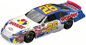
Old Town Media: What’s the first thing you think about when you see Ricky Bobby’s car.
Katie Hutmacher: I don’t know why anybody would sponsor one of those cars, unless you’re the main sponsor on the hood. There’s just way too much going on here to see anything but the bread logo. That logo is so dominant visually, all the other sponsors on the side are being totally overshadowed. Those companies are wasting their money.
OTM: How would you handle the design to get more exposure for all those smaller brands on the side of the car?
KH: I wouldn’t. Those are just there to say you sponsor a NASCAR racer. From a design perspective, they serve no purpose.
OTM: So how would you go about designing a NASCAR car?
KH: I’d do it totally different from everything else. All these cars look the same. Just a bunch of logos slapped anywhere they’ll fit. If you want to stand out from the pack, you’d have to be different.
OTM: So you’d do something, what, more minimal?
KH: Not like Apple [branding] but something without six dozen random logos on the side. I’d think of it like a reverse billboard: Instead of driving by it very fast, it’s going by you very, very fast. I mean, you don’t drive 180 mph or whatever past a billboard, so you’d have to take that idea to the extreme.
You’d have to follow the six-word rule, make visuals really, really easy to distinguish and very bold. All these cars do exactly the opposite of that.