When you’re making that initial jump from print marketing materials to digital marketing materials, there are some key components to be aware of.
Here are our top 3 design tips to guide you away from making your website look like a creative disaster:
1. Text Alignment
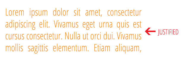
Justification:
To justify text means to adjust the length of the line so that it is flush left and right on the measure. Justification is primarily used in print design and not web. The alignment does not hold the same way when it’s presented digitally and you can’t hyphenate the words to keep the spacing even. Your website can be much harder to read if you justify the text, so we recommend keeping justified text to print materials only.
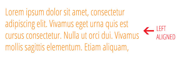
Left Aligned:
Left aligning copy is the most standard practice for websites. When in doubt, stick with left alignment. It is also the easiest for your user to read.
2. Fonts
San-Serif Vs. Serif fonts:
Serif fonts include fonts that do have the small projecting features called “serifs” at the end of strokes. Serif fonts are more traditional and they are most commonly used in the body copy of print pieces. In the past, many people have stayed away from using serif fonts for the body copy of a website. With the evolution of web fonts and the ability to have so many more variations, we would say that with the right font, using a serif font for your body copy would be just fine.

San-Serif fonts are more modern fonts as they do not have the small projecting features called “serifs.” This is the most common type of font used in the body copy of a website. Some can argue it is easier on your eyes to read when on the web.

3. Aligning Images for the web
As the Creative Director at Old Town Media, my biggest pet peeve is when people align images right, left and center all on the same page of a website. For print, you have a lot of flexibility with moving images all over the place and getting creative with the layout. For a website, your main focus should be usability. With that being said, you want to have a grid-like consistency of your copy and keep all images on that page either right aligned or left aligned.
Pro-tip: Never center align a photo on the web.