It’s summer movie season, and that means one thing to designers: looking at lots and lots of summer blockbusters posters. This summer’s pretty heavy on sequels, so we’re flush with a ton of posters that rely on viewers’ familiarity with franchises to make their point, which has led many of them to have a bit more freedom than other posters.
Movie posters aren’t just cool images when you’re a designer. There’s a lot do dissect in each one. Here’s how some of the summer blockbuster posters look through a designer’s eyes.
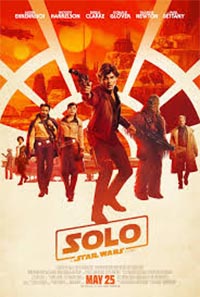 Solo
Solo
I like how the background incorporates the view from the cockpit of the Millennium Falcon, which is a pretty cool design element. This poster is weird for a Star Wars one. It steps away from the montage of faces on a dark background that’s been the format for a long, long time. The title of the movie, Solo, is really short, which doesn’t really work in the standard Star Wars type, which bothers me.
The lighter colors are interesting, though. I don’t know anything about this movie other than Donald Glover is in it. Is it a more lighthearted one? The colors make it look like that.
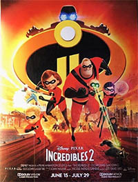
The Incredibles 2
This color scheme is very similar to Solo. This doesn’t tell us much about the movie, other than there’s a shadowy villain up at the top that nobody really knows about, and that the entire family is back in it. This is really playing on the fact that you probably alreadly know all you need to know about The Incredibles to want to see this.
The touch they did with the two I’s for the sequel is neat. It’s a pretty common idea, but I really like when they have touches like that.
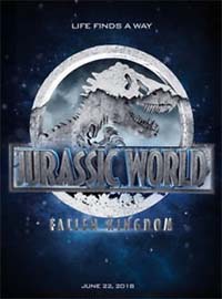
Jurrassic World: Fallen Kingdom
[Book Cover Designer] Chip Kidd made the original Jurassic Park book cover back in 1993. I like that they’ve kept his design through how many movies, five? The T-Rex is really identifiable, which is great branding. Everyone knows this icon, whether you saw the original movies in the ’90s or are just getting into it now. That’s awesome. They change it up, by adding layers, dimension and texture, enough on this to make it unique for this movie.
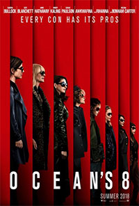
Ocean’s 8
I love this poster. I love most of the artwork for this movie, versus what they did on the prior ones. I really like how they did all the stacking and made a really cool composition. The perspective is a little off, but that’s OK: Movie posters don’t need to be perfectly accurate, and twisting perspective here really works for them.
They did a good job of spacing the words out in the title, too, other than that apostrophe, which looks really weird.
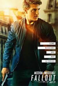
Mission: Impossible – Fallout
This poster is literally all based on getting people to look at Tom Cruise. If they’re a fan of Tom Cruise, they’ll come to this movie. I know nothing about this movie, other than he’s in it and it’s another Mission Impossible movie. I don’t really like what’s going on with the length of the shapes in the words next to him.
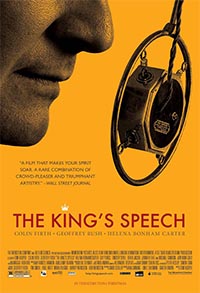
After looking at the slate of upcoming releases, I’d love to throw out my personal favorite movie poster, for The King’s Speech. I like this one because it doesn’t focus on who is it in it. You can’t even see all of Colin Firth’s face. Instead, it tells you exactly what the movie is about. It’s concise and just a really nice, simple design.